
About
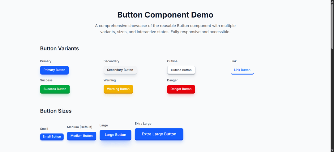
A comprehensive showcase of the reusable Button component with multiple variants, sizes, and interactive states. Fully responsive and accessible.
Built with React and Tailwind. Copy the prompt and paste it into Claude Code, Cursor or Lovable: your agent adds 3D button to your project and fits it to your theme.
Code
How 3D button is used: the demo's code. The component's own source comes with a free account.
Usage.tsx
import { Component } from "@/components/ui/3d-button";

export default function DemoOne() {
  return <Component />;
}
Dependencies
More by Awanish Verma
View all
particle effect for hero
1.3K
bento grid 01
1.2K
3D Folder
1.2K
Thumbnail Carousel
712
infinite grid integration
515
hover image preview
231
dropdown 01
185
3D tilt card
170
More in Buttons
View all
Texture Button
108
Button
14

Notification Button
117

HeroUI Button Group
2

Eclipse Button
44
Button Save
50

App Store Button
484

Base Button
1


