
About
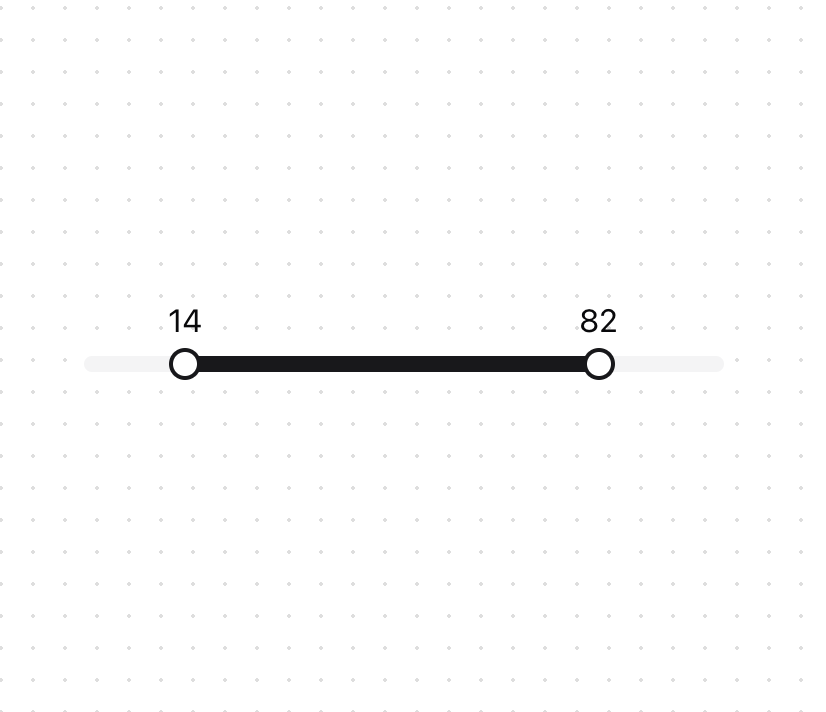
An enhancement slider that allows you to select a range of values.
Built with React and Tailwind. Copy the prompt and paste it into Claude Code, Cursor or Lovable: your agent adds Dual Range Slider to your project and fits it to your theme.
Code
How Dual Range Slider is used: the demo's code. The component's own source comes with a free account.
Usage.tsx
'use client';
import React, { useState } from 'react';
import { DualRangeSlider } from '@/components/ui/dual-range-slider';

const DualRangeSliderDemo = () => {
  const [values, setValues] = useState([0, 100]);

  return (
    <div className="w-full max-w-[400px] px-10">
      <DualRangeSlider
        label={(value) => value}
        value={values}
        onValueChange={setValues}
        min={0}
        max={100}
        step={1}
      />
    </div>
  );
};

export { DualRangeSliderDemo };
Dependencies
More by Arihant jain
View all
Footer section
2K
Multistep Form
755
Animated Drawer
703
Status Badge
598
Stacked Circular Footer
457
Input Modal
371
Profile Dropdown
216
Large Name Footer
205
More in Forms
View all

Login 1
64

Premium Auth
571

Contact Card
1.1K

Form
18

Book A Demo 1
91
Authentication Card
52

Card Studio
47

Login Card
35
