
About
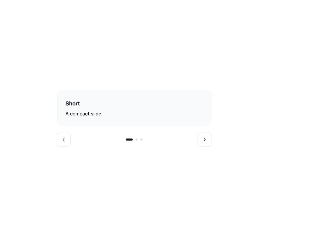
A draggable, swipeable image/content slider with arrows, dot pagination, thumbnails, autoplay, fade, and auto-height, for showcasing photo galleries or product shots one slide at a time.
Built with React and Tailwind. Copy the prompt and paste it into Claude Code, Cursor or Lovable: your agent adds Carousel to your project and fits it to your theme.
Code
How Carousel is used: the demo's code. The component's own source comes with a free account.
Usage.tsx
import {
  Carousel,
  CarouselContent,
  CarouselSlide,
  CarouselPrev,
  CarouselNext,
  CarouselPagination,
} from "@/components/ui/carousel";
import { Button } from "@appica/ui-react/button";
import { ChevronLeft, ChevronRight } from "@appica/icons-react";

const CARDS = [
  { title: "Short", body: "A compact slide." },
  {
    title: "Medium",
    body: "This slide carries a couple of sentences, so it stands a little taller than the first. The viewport grows to fit it.",
  },
  {
    title: "Tall",
    body: "And this one runs longer still. Auto Height animates the viewport between each slide's natural height as you navigate, so nothing is clipped and there's no empty space below shorter slides. It keeps mixed-length content - quotes, cards, forms - looking tidy inside a single carousel.",
  },
];

export default function CarouselAutoHeight() {
  return (
    <div className="w-full max-w-md">
      <Carousel loop autoHeight align="start">
        <CarouselContent>
          {CARDS.map((card) => (
            <CarouselSlide key={card.title}>
              <div className="border-border-muted bg-background-subtle rounded-xl border p-6">
                <h4 className="text-foreground-intense mb-2 font-semibold">
                  {card.title}
                </h4>
                <p className="text-sm">{card.body}</p>
              </div>
            </CarouselSlide>
          ))}
        </CarouselContent>
        <div className="mt-5 flex items-center justify-between gap-4">
          <CarouselPrev
            position="none"
            render={
              <Button variant="outline" size="icon-md">
                <ChevronLeft />
              </Button>
            }
          />
          <CarouselPagination />
          <CarouselNext
            position="none"
            render={
              <Button variant="outline" size="icon-md">
                <ChevronRight />
              </Button>
            }
          />
        </div>
      </Carousel>
    </div>
  );
}
Dependencies
More by appica-dev
View all
Border Beam
71
Text Animate
23
Avatar
17
Table of Contents
10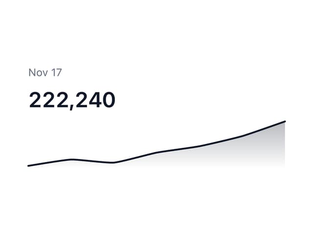
Sparkline
9
Background Pattern
8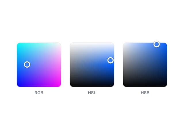
Color Area
7
Alert
3
More in Cards
View all

Course Design Cards
1.3K

Statistics Card 7
327
Statistics Card 2
305

Interactive Tech Stack Bento Grid with Hover Effects
625

Card Studio
5
The Item one
4

Weather Card
65

Card
9