
About
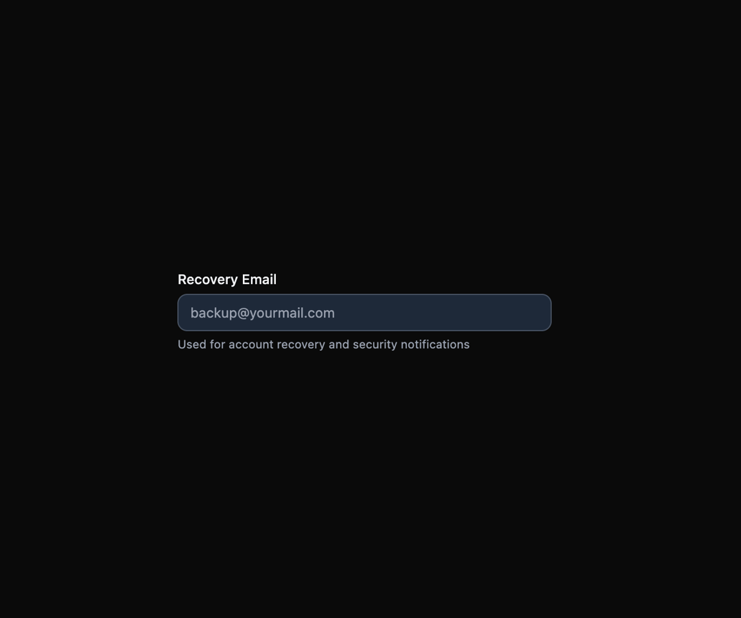
Here is Field Components
Built with React and Tailwind. Copy the prompt and paste it into Claude Code, Cursor or Lovable: your agent adds Field Components to your project and fits it to your theme.
Code
How Field Components is used: the demo's code. The component's own source comes with a free account.
Usage.tsx
import { Field } from "@ark-ui/react/field";

export default function InputWithHelperText() {
  return (
    <Field.Root className="max-w-sm w-full">
      <Field.Label className="text-sm font-medium text-gray-900 dark:text-gray-100">
        Recovery Email
      </Field.Label>
      <Field.Input
        type="email"
        placeholder="[email protected]"
        className="mt-1 block w-full rounded-lg border border-gray-300 dark:border-gray-600 bg-white dark:bg-gray-800 px-3 py-2 text-sm text-gray-900 dark:text-gray-100 placeholder-gray-500 dark:placeholder-gray-400 focus:border-gray-900 dark:focus:border-gray-100 focus:outline-hidden focus:ring-1 focus:ring-gray-900 dark:focus:ring-gray-100"
      />
      <Field.HelperText className="mt-1 text-xs text-gray-500 dark:text-gray-400">
        Used for account recovery and security notifications
      </Field.HelperText>
    </Field.Root>
  );
}
Dependencies
More by Abraham
View all

Signature Pad
115
Carousel
85
timeline-animation
68
Basic Toast
60
Calendar
58
Menu
53
QR Code
53
Steps
50
More in Forms
View all

Login 1
64

Premium Auth
571

Contact Card
1.1K

Form
18

Book A Demo 1
91
Authentication Card
52

Card Studio
47

Login Card
35
