About
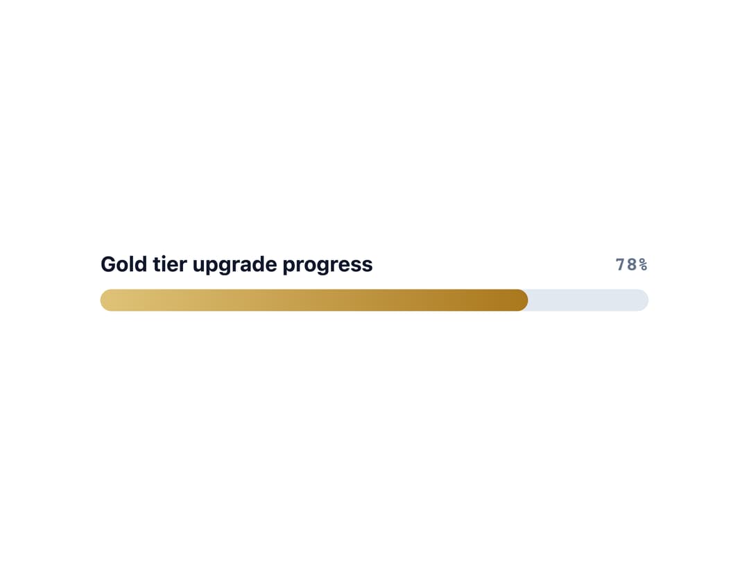
A progress bar that shows task completion as a filled, percentage-based track, with labels, tones, stripes, animation, and an indeterminate loading state.
Built with React and Tailwind. Copy the prompt and paste it into Claude Code, Cursor or Lovable: your agent adds Progress Bar to your project and fits it to your theme.
Code
How Progress Bar is used: the demo's code. The component's own source comes with a free account.
Usage.tsx
import Progress from "@/components/ui/progress";

export default function ProgressLuxuryDemo() {
  return (
    <div className="w-full max-w-md flex flex-col gap-4 p-6 bg-background text-foreground">
      <Progress
        tone="luxury"
        size="lg"
        value={78}
        label="Gold tier upgrade progress"
        showValue
      />
    </div>
  );
}
More by alwkala
View all

Callout
7
Kbd
Pagination
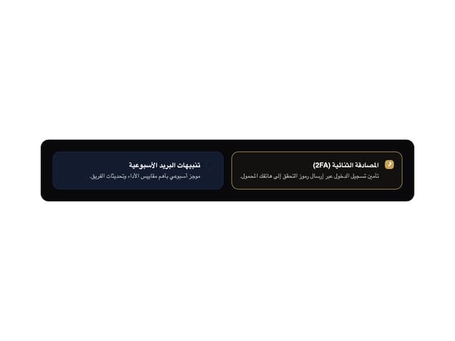
Checkbox
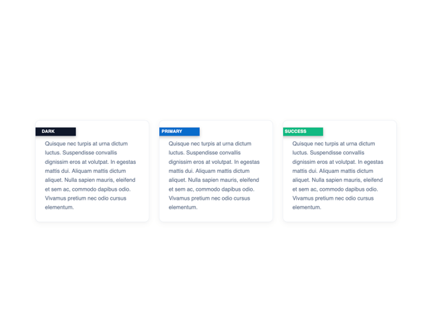
Ribbon
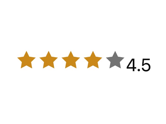
Rating
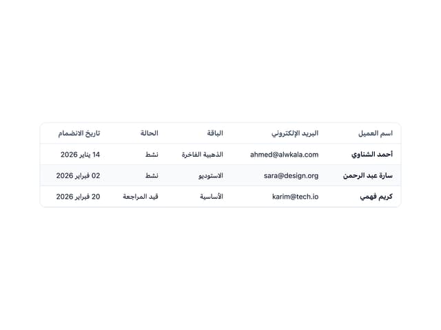
Data Table
Navbar