
About
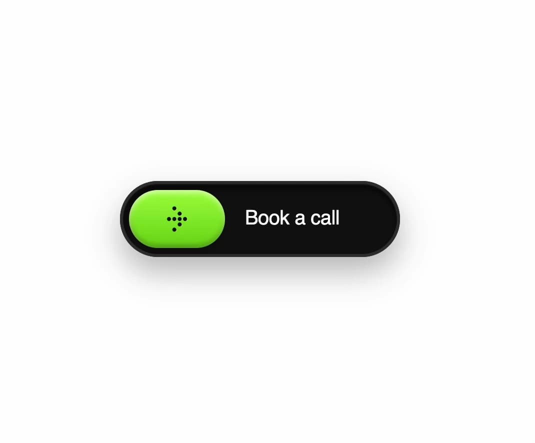
A dark pill button with an acid-green slider that expands on hover, swapping a dotted arrow icon for a ringing-phone icon while the label fades out.
Built with React and Tailwind. Copy the prompt and paste it into Claude Code, Cursor or Lovable: your agent adds Glossy Slider Call Button to your project and fits it to your theme.
Code
How Glossy Slider Call Button is used: the demo's code. The component's own source comes with a free account.
Usage.tsx
"use client";

import BookCallButton from "@/components/ui/glossy-slider-call-button";

export default function GlossySliderCallButtonDemo() {
  return (
    <div className="flex min-h-screen w-full items-center justify-center">
      <BookCallButton />
    </div>
  );
}
More by Alok
View all

Chained Spring Arc Carousel
148
3D Book Carousel Reading Mode
129
Collapsing Cards Accordion
125
Dot Graph Card
68
Interactive Card Sphere
63
Cell-to-Card Calendar Expansion
38
Split Panel Image-Synced FAQ/Features
35
Flex-Grow Benefits Reveal
31
More in Buttons
View all
Texture Button
108
Button
14

Notification Button
117

HeroUI Button Group
2

Eclipse Button
44
Button Save
50

App Store Button
484

Base Button
1


