
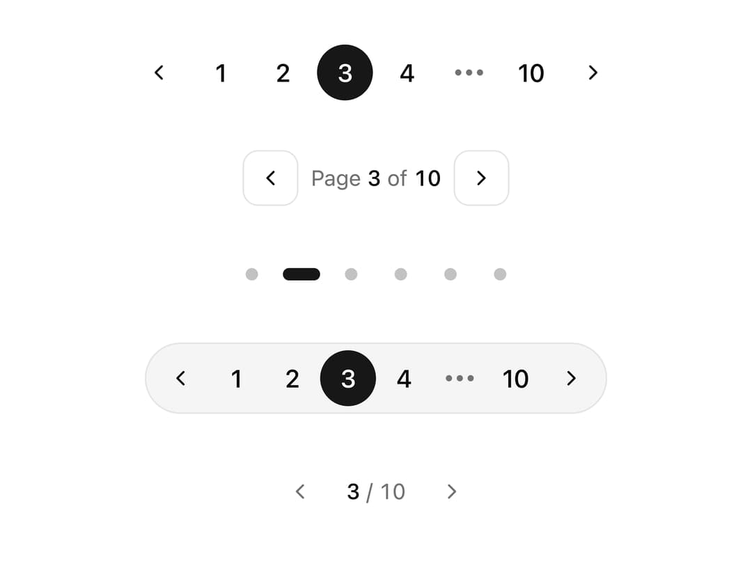
About
A set of five decorative, animated pagination controls (numbered, arrows, dots, pills, minimal) for paging through lists, tables or carousels, with a sliding active-page highlight and reduced-motion support.
Built with React and Tailwind. Copy the prompt and paste it into Claude Code, Cursor or Lovable: your agent adds Styled Pagination to your project and fits it to your theme.
Code
How Styled Pagination is used: the demo's code. The component's own source comes with a free account.
Usage.tsx
import {
  NumberedPagination,
  ArrowsPagination,
  DotsPagination,
  PillPagination,
  MinimalPagination,
} from "@/components/ui/pagination-styled";

export default function PaginationStyledDemo() {
  return (
    <div className="flex w-full flex-col items-center justify-center gap-8 p-10">
      <NumberedPagination total={10} defaultPage={3} />
      <ArrowsPagination total={10} defaultPage={3} />
      <DotsPagination total={6} defaultPage={2} />
      <PillPagination total={10} defaultPage={3} />
      <MinimalPagination total={10} defaultPage={3} />
    </div>
  );
}
Dependencies
More by ai 2
View all
Ripple Buttons
33
Styled Toggle Switches
21
Styled Progress Bars
17
Styled Badges
15
Particle Toggles
14
OTP Pin Input
12
File Input
11
Combo Kbd
11
More in Navigation
View all

Liquid Glass Expandable Sidebar
76

Footer with Big Wordmark
40

Sidebar
392

Oversized 404 Numeral
78
Navbar with Theme Toggle
67

NavBar
2

Pagination
109
Tabs like bookmark
82
