
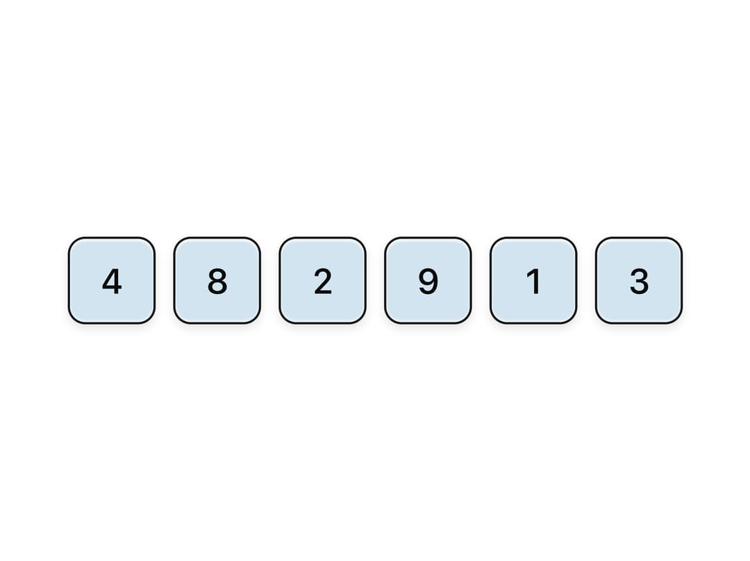
About
A one-time-password / verification-code input made of frosted-glass digit cells, with five decorative surface variants (frost, tint, smoke, crystal, depth) and sizes from sm to xl.
Built with React and Tailwind. Copy the prompt and paste it into Claude Code, Cursor or Lovable: your agent adds Glass OTP Input to your project and fits it to your theme.
Code
How Glass OTP Input is used: the demo's code. The component's own source comes with a free account.
Usage.tsx
"use client";

import InputOtpGlass, { TintOtp } from "@/components/ui/input-otp-glass";

export default function InputOtpGlassDemo() {
  return (
    <div className="flex min-h-[240px] w-full items-center justify-center p-10">
      <TintOtp length={6} defaultValue="482913" />
    </div>
  );
}
More by ai 2
View all
Ripple Buttons
33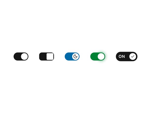
Styled Toggle Switches
21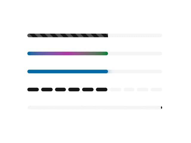
Styled Progress Bars
17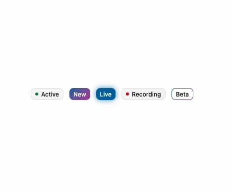
Styled Badges
15
Particle Toggles
14
OTP Pin Input
12
File Input
11
Combo Kbd
11
More in Forms
View all

Login 1
64

Premium Auth
571

Contact Card
1.1K

Form
18

Book A Demo 1
91
Authentication Card
52

Card Studio
47

Login Card
35
