
About
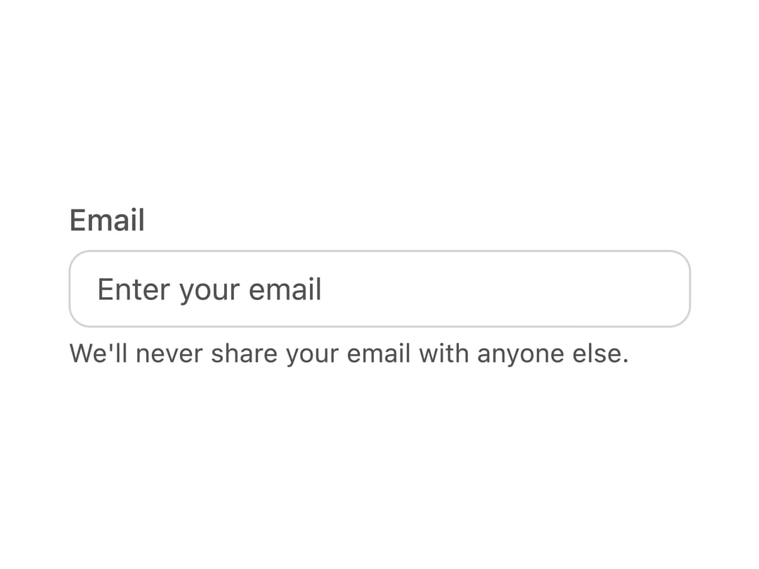
A set of accessible form field building blocks (label, input, description, error message, and bordered input group) used to compose text inputs and other form controls with React Aria Components.
Built with React and Tailwind. Copy the prompt and paste it into Claude Code, Cursor or Lovable: your agent adds Field to your project and fits it to your theme.
Code
How Field is used: the demo's code. The component's own source comes with a free account.
Usage.tsx
import { Label, Input, Description, FieldGroup } from "@/components/ui/field";

export default function FieldDemo() {
  return (
    <div className="flex items-center justify-center w-full p-10">
      <div className="flex flex-col gap-1 font-sans w-72">
        <Label>Email</Label>
        <FieldGroup>
          <Input placeholder="Enter your email" />
        </FieldGroup>
        <Description>
          We'll never share your email with anyone else.
        </Description>
      </div>
    </div>
  );
}
Dependencies
More by py_ets
View all
Alert Dialog
15
Command Palette
9
React Aria CheckboxGroup
9
Progress Bar
8
React Aria DatePicker
7
Segmented Control
6
React Aria Switch
6
React Aria GridList
5
More in Forms
View all

Login 1
64

Premium Auth
571

Contact Card
1.1K

Form
18

Book A Demo 1
91
Authentication Card
52

Card Studio
47

Login Card
35
