
About
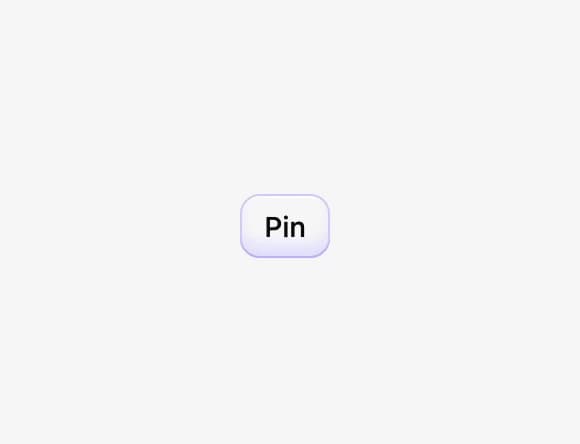
A pressable two-state button that can be toggled on or off, styled with plain CSS and built on React Aria for full accessibility.
Built with React and Tailwind. Copy the prompt and paste it into Claude Code, Cursor or Lovable: your agent adds Toggle Button to your project and fits it to your theme.
Code
How Toggle Button is used: the demo's code. The component's own source comes with a free account.
Usage.tsx
import ToggleButton from "@/components/ui/css-togglebutton";

export default function ToggleButtonDemo() {
  return (
    <div className="flex items-center justify-center w-full h-screen bg-[var(--background-color,#f8f8f8)]">
      <ToggleButton>Pin</ToggleButton>
    </div>
  );
}
Dependencies
More by py_ets
View all
Alert Dialog
15
Command Palette
9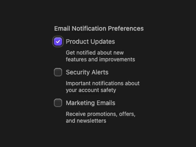
React Aria CheckboxGroup
9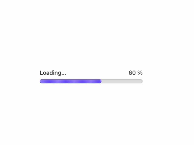
Progress Bar
8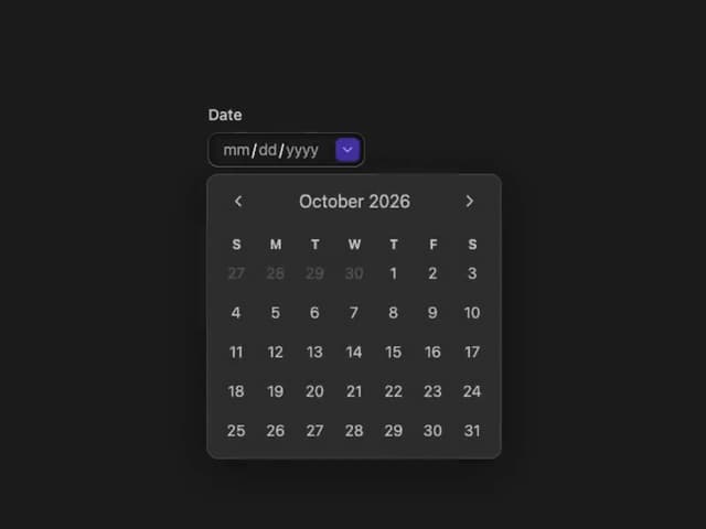
React Aria DatePicker
7
Segmented Control
6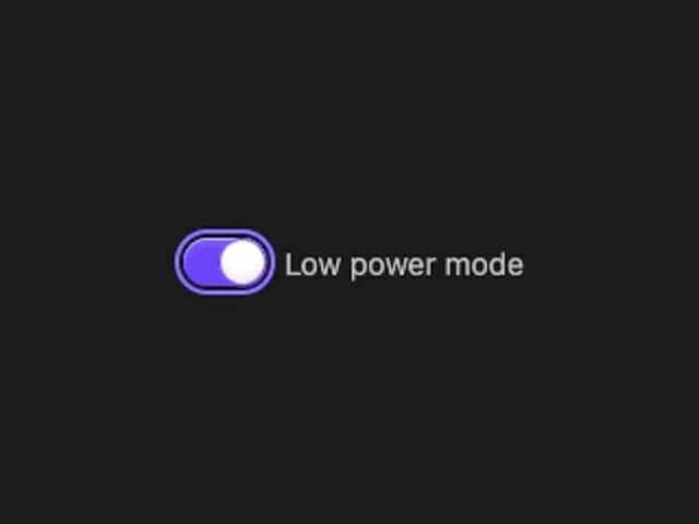
React Aria Switch
6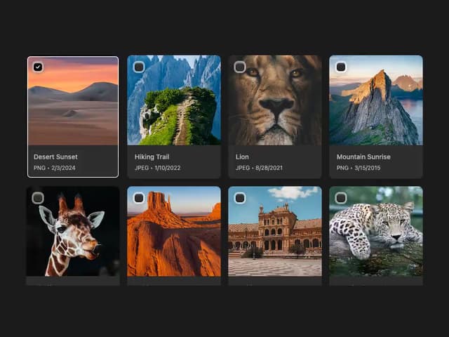
React Aria GridList
5
More in Buttons
View all
Texture Button
108
Button
14

Notification Button
117

HeroUI Button Group
2

Eclipse Button
44
Button Save
50

App Store Button
484

Base Button
1


