
About
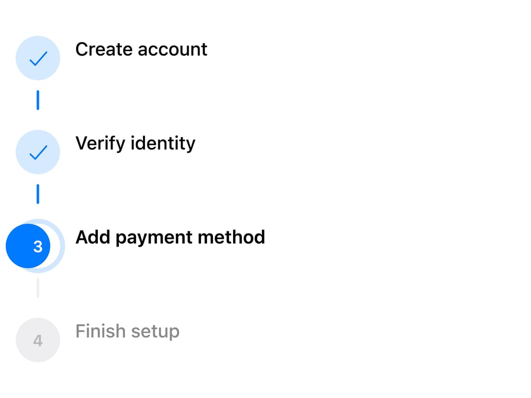
A numbered progress stepper for walking a user through a multi-step sequence like checkout or device setup, with horizontal/vertical layouts, per-step status (complete/current/upcoming/error), and an optional clickable mode with a sliding selection thumb.
Built with React and Tailwind. Copy the prompt and paste it into Claude Code, Cursor or Lovable: your agent adds Steps to your project and fits it to your theme.
Code
How Steps is used: the demo's code. The component's own source comes with a free account.
Usage.tsx
import { Steps } from "@/components/ui/steps";
import { useState } from "react";

const SETUP = [
  { title: "Create account" },
  { title: "Verify identity" },
  { title: "Add payment method" },
  { title: "Finish setup" },
];

export default function StepsClickableDemo() {
  const [current, setCurrent] = useState(2);
  return (
    <div style={{ maxWidth: 420, width: "100%" }}>
      <Steps
        items={SETUP}
        orientation="vertical"
        clickable
        current={current}
        onStepChange={setCurrent}
      />
    </div>
  );
}
Dependencies
More by adit-firdaus
View all
Popover
3
Adaptive Card

Box
Pagination
More in Navigation
View all

Liquid Glass Expandable Sidebar
76

Footer with Big Wordmark
40

Sidebar
392

Oversized 404 Numeral
78
Navbar with Theme Toggle
67

NavBar
2

Pagination
109
Tabs like bookmark
82
