
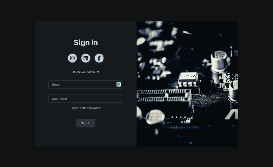
About
A SignIn card component featuring animated buttons, input fields, and social media icons, all enhanced with gradient effects for a modern visual appeal.
Built with React and Tailwind. Copy the prompt and paste it into Claude Code, Cursor or Lovable: your agent adds Sign In to your project and fits it to your theme.
Code
How Sign In is used: the demo's code. The component's own source comes with a free account.
Usage.tsx
import Component from "@/components/ui/sign-in-7";

const DemoOne = () => {
  return (
    <div className="flex w-full h-screen justify-center items-center">
      <Component />
    </div>
  );
};

export { DemoOne };
Dependencies
More by Abishekaraj Immanuel
View all
Carousel card
364
Button
308
SignIn
1
Button

Carousel card

carousel card
More in Sign-in
View all

Modern & Stunning sign in
1.8K
SignInPage
766
Clean & Minimal sign in
677

Sign In Form
216
Sign In
108

Split Sign In Form
122
Authentication Card
52
Sign In Card
2.8K


