
About
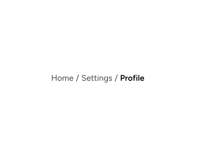
An individual Astryx breadcrumb item supporting links, current-page text, icons, and click handlers.
Built with React and Tailwind. Copy the prompt and paste it into Claude Code, Cursor or Lovable: your agent adds Astryx Breadcrumb Item to your project and fits it to your theme.
Code
How Astryx Breadcrumb Item is used: the demo's code. The component's own source comes with a free account.
Usage.tsx
'use client';

import {Breadcrumbs, BreadcrumbItem} from '@/components/ui/astryx-breadcrumb-item';

function BreadcrumbItemBasic() {
  return (
    <Breadcrumbs>
      <BreadcrumbItem href="/">Home</BreadcrumbItem>
      <BreadcrumbItem href="/settings">Settings</BreadcrumbItem>
      <BreadcrumbItem isCurrent>Profile</BreadcrumbItem>
    </Breadcrumbs>
  );
}

export default function BreadcrumbItemBasicDemo() {
  return (
    <div
      data-astryx-theme="neutral"
      data-theme="light"
      style={{colorScheme: 'light', display: 'contents'}}>
      <BreadcrumbItemBasic />
    </div>
  );
}
Dependencies
More by Astryx
View all

Astryx Banner
59
Astryx Aspect Ratio
31
Astryx Avatar
30
Astryx Badge
29
Astryx Button Group
27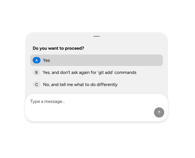
Astryx Chat Composer Drawer
20
Astryx Toggle Button
17
Astryx Avatar Group
9
More in Navigation
View all

Liquid Glass Expandable Sidebar
76

Footer with Big Wordmark
40

Sidebar
392

Oversized 404 Numeral
78
Navbar with Theme Toggle
67

NavBar
2

Pagination
109
Tabs like bookmark
82
