
About
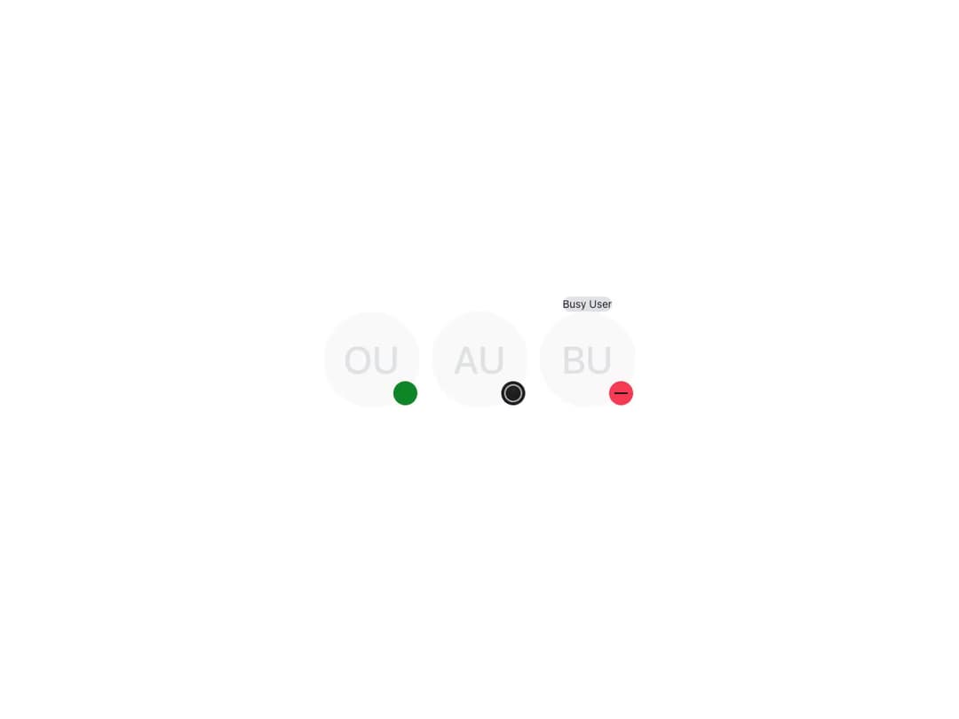
A size-aware Astryx avatar presence indicator with distinct success, neutral, and error shapes.
Built with React and Tailwind. Copy the prompt and paste it into Claude Code, Cursor or Lovable: your agent adds Astryx Avatar Status Dot to your project and fits it to your theme.
Code
How Astryx Avatar Status Dot is used: the demo's code. The component's own source comes with a free account.
Usage.tsx
"use client"

import AvatarStatusDot from "@/components/ui/astryx-avatar-status-dot"
import { Avatar } from "@astryxdesign/core/Avatar"
import { HStack } from "@astryxdesign/core/Layout"

export default function AvatarStatusDotDemo() {
  return (
    <div data-astryx-theme="neutral" data-theme="light" style={{ colorScheme: "light", display: "contents" }}>
      <HStack gap={4} vAlign="center">
        <Avatar name="Online User" size="xl" status={<AvatarStatusDot variant="success" label="Online" />} />
        <Avatar name="Away User" size="xl" status={<AvatarStatusDot variant="neutral" label="Away" />} />
        <Avatar name="Busy User" size="xl" status={<AvatarStatusDot variant="error" label="Busy" />} />
      </HStack>
    </div>
  )
}
Dependencies
More by Astryx
View all

Astryx Banner
59
Astryx Aspect Ratio
31
Astryx Avatar
30
Astryx Badge
29
Astryx Button Group
27
Astryx Chat Composer Drawer
20
Astryx Toggle Button
17
Astryx Avatar Group
9